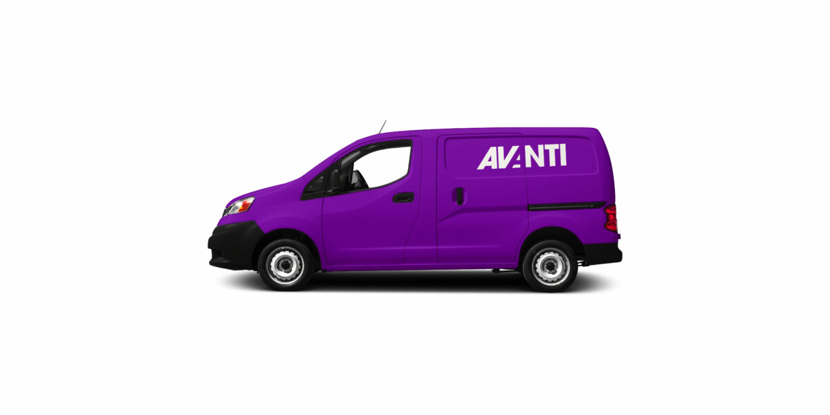
Tasked with the re-design of Avanti’s logo, we wanted to create something that captured the speed and energy behind this brilliant family business with strong innovative and sustainable values. Avanti began life in the 1980’s and has grown to offer hygiene, catering and workplace supplies all with a sustainable focus, nowadays led by the next generation of the family.

Sense of movement achieved with typography alone
The name Avanti (Forward) is a link back to the family’s Italian routes. The previous logo incorporated an arrow illustration; a nod towards the translation along with movement, delivery and distribution. We wanted to capture this same notion of forward movement but through typography rather than needing to add an extra illustration element. Logos that convey a message intelligently via the typography alone will always be less busy than one that requires an illustrative component to communicate its message.
We worked really closely with Avanti to get the colour palette and brand image correct.
This logo makes clever use of negative space, utilising the strong edges of the V and N to form a reversed out A. The strong, clean lines and bold form of ITC Avant Garde lent itself perfectly to this with an effortless result that reads very easily, without looking contrived.
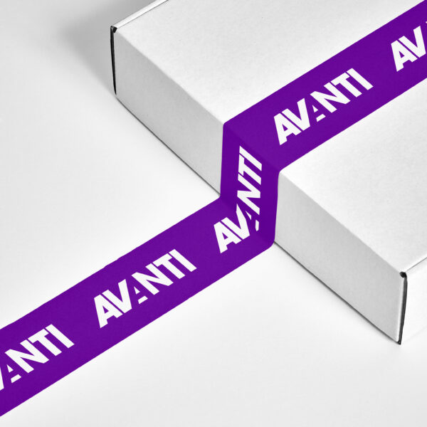
We used a gradient and reflection effect to add dynamism and a contemporary aesthetic. We’ve written about the power of gradients in branding, and the Avanti logo is definitely a great example of how a gradient can be used effectively in a brand identity. This use of gradient versus the plain, flat colour alternatives in the brand guidelines make the Avanti logo an example of dynamic branding too.