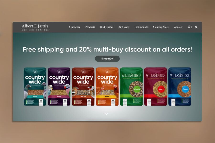
Albert E James and Son Ltd are producers of specialist bird feeds, creating their own unique blends from their mill just outside Bristol, since 1962. Their customers range from award-winning bird keepers to bird lovers re-filling their bird feeders in gardens across the UK. They came to us in desperate need of a new brand identity and website.

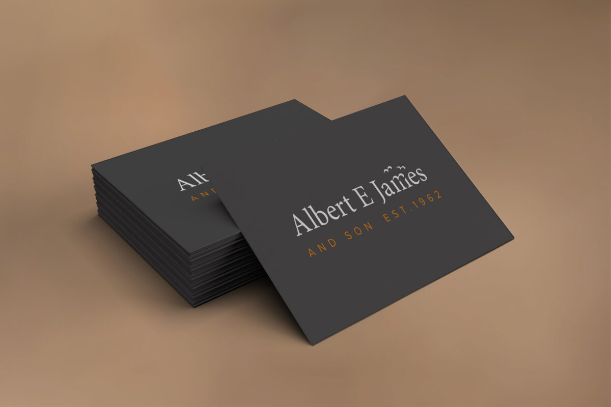
The new brand identity consists of a serif typeface and sans serif strap line, combined with a slate grey primary brand colour and an orange accent colour. The intension of these ‘juxtapositions’ was to convey a primarily traditional feel but with a nod towards contemporary.
Weaving in further relevance to this identity, we dissected the letter m which conveniently formed a silhouette of a flying bird. Duplicating this a couple of times and subtly adjusting scale and position, we’ve achieved a lovely trio of flying birds.
Following this we designed the brand identities and packaging for their two sub-brands, Countrywide and Willsbridge, which you can read about here.
We then designed and built a contemporary new e-commerce website giving the company access to customers further afield. This website is a fully custom WordPress theme: aejames.com