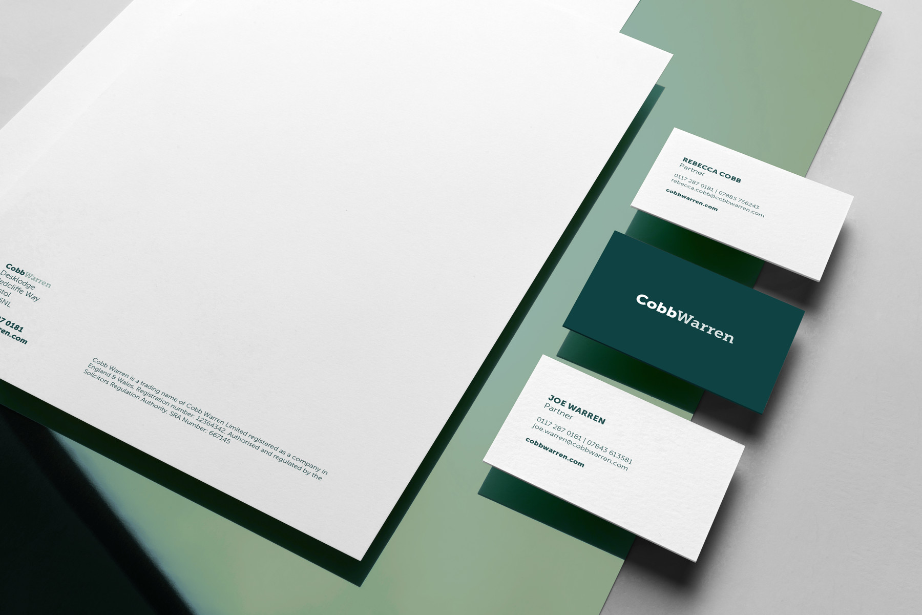
Before Bristol-based law firm Cobb Warren launched their business, they needed a distinctive brand design to be used seamlessly across their corporate stationery and digital branded materials.
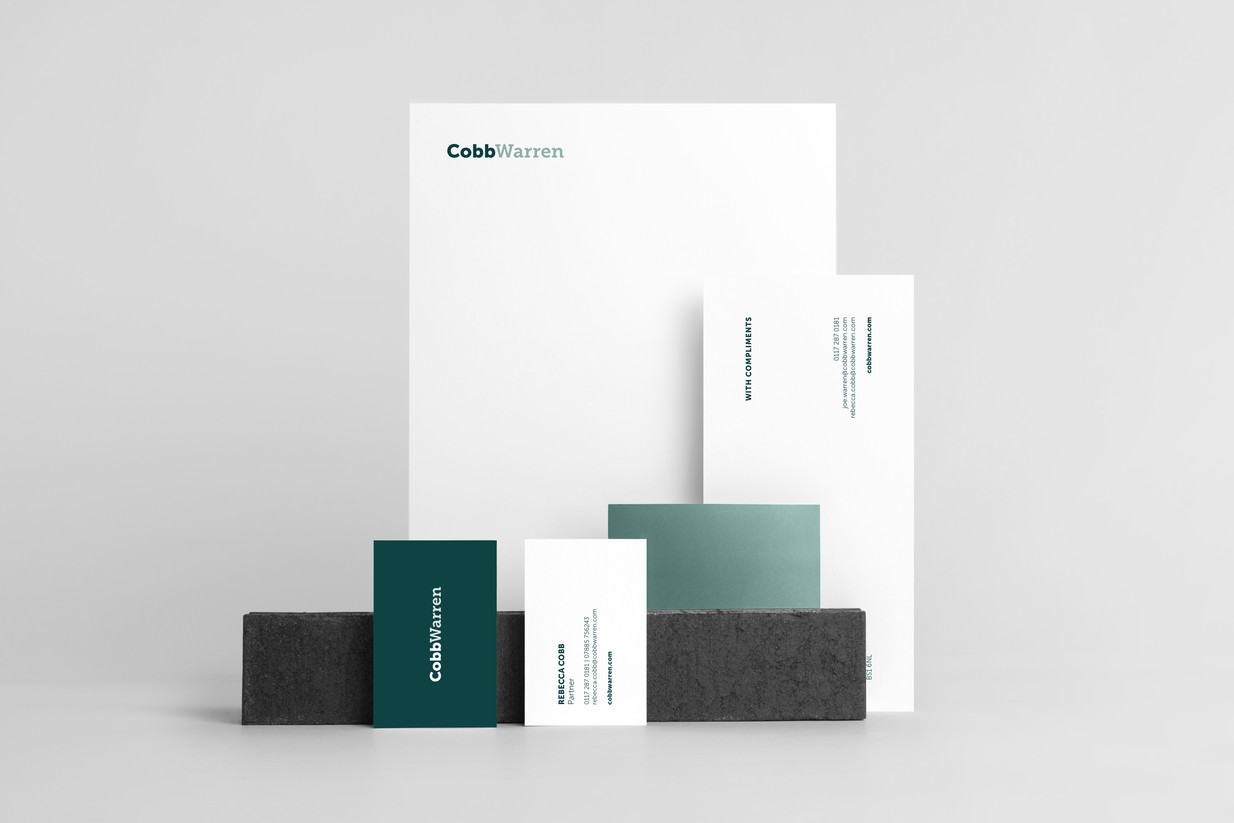
Complementary font pairing is used in the logo: one typeface for each founding partner of the firm. Museo Sans 900 for Cobb, and Museo Slab 700 for Warren. The reason we chose these two typefaces in these specific weights was to achieve an equal weighting between the two names; the font-weight used for Cobb is heavier than that of Warren, to make up for the difference in length. The result is a piece of typography pairing that delivers on juxtaposition, but also ensures both names are balanced and read equally.

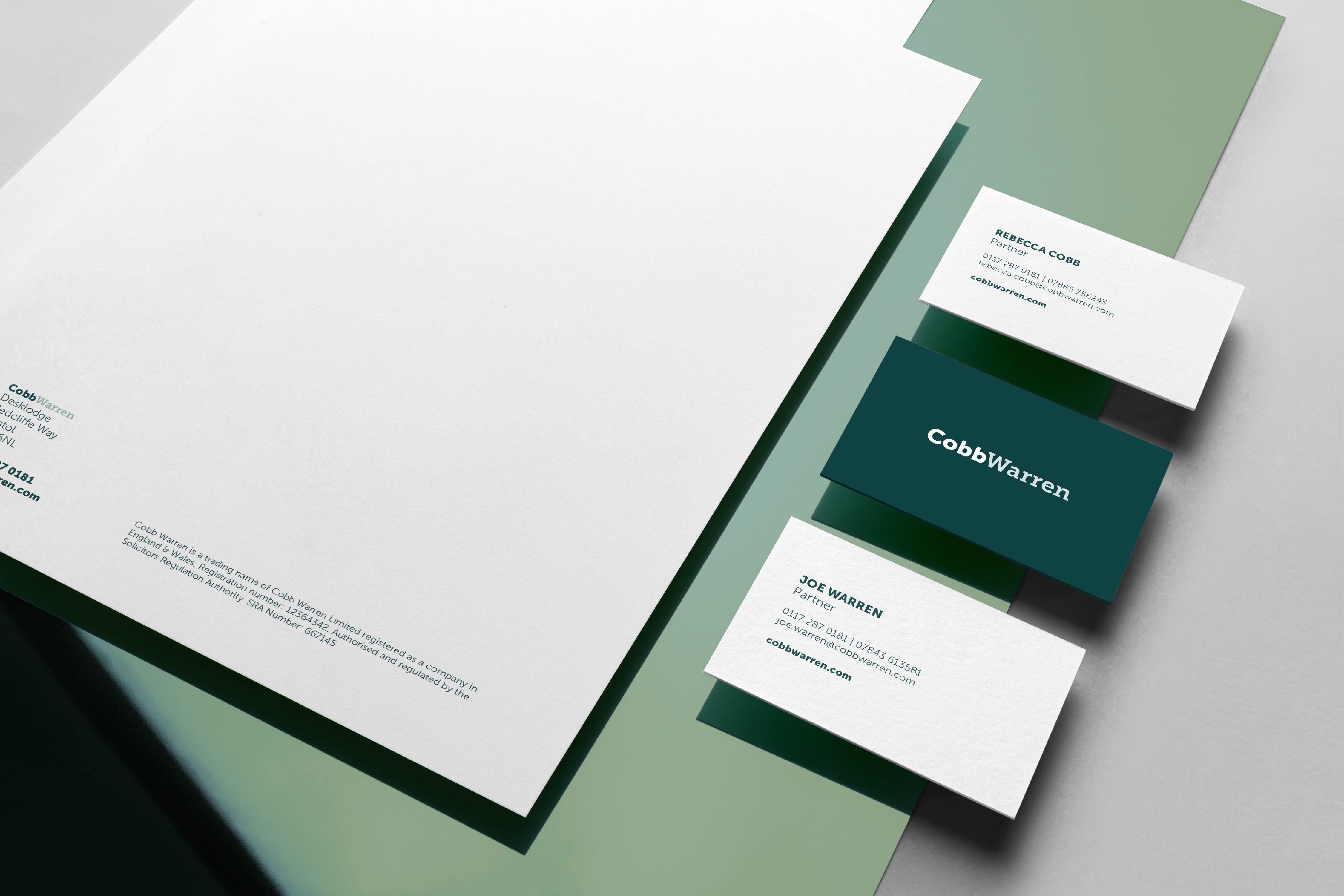
The colour palette was inspired by the historic legacy of the legal world, using a deep, emerald green reminiscent of old book covers for a hint of timeless antiquity. Bringing these elements together results in a contemporary design which met the client’s brief and ensures their brand is off to a strong start.