

At 68° North, cruising through the Lofoten Archipelago in the Arctic Circle, is the subject of our recent project; HMS Gåssten. This stunning ship has carried kings, saved lives, worked for the UN Coastguard and survived wars. Its duty today is exploring the Norwegian Fjords with passengers searching for an adventure. With a commitment to sustainability along it’s journeys, this ship belongs to Surfers Against Sewage’s ‘The 250 Club’ and donates 1% of turnover to global eco funds and charities through onepercentfortheplanet.org – demonstrating values that align very closely with our own at Winter Design.
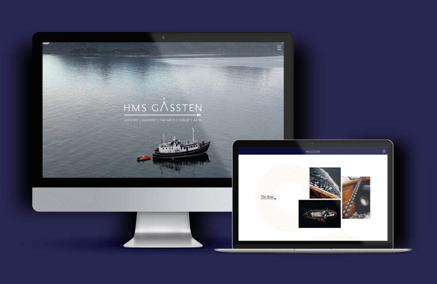
Our mission was to create a modern, timeless online space to share the story of HMS Gåssten and amplify the unique experiences they offer, encouraging visitors to book their private charter. We achieved this through a huge range of images and drone video footage across the site in varying formats, partnered with a range of complimentary text layouts and equally beautiful typography. We’re proud to show off this visually compelling website full of adventure, excitement and class.
We’re not afraid of challenging dated design – for example, mixing up text alignments within pages to share stories more effectively through a contemporary eye. On every page, we maximised white space and considered the powerful dynamic between text and images to best display the information. Central alignments for elegance and sophistication, split text alignments to share statistics, right text alignment alongside an image within our signature media object – we consciously curated each aspect of the page layouts.
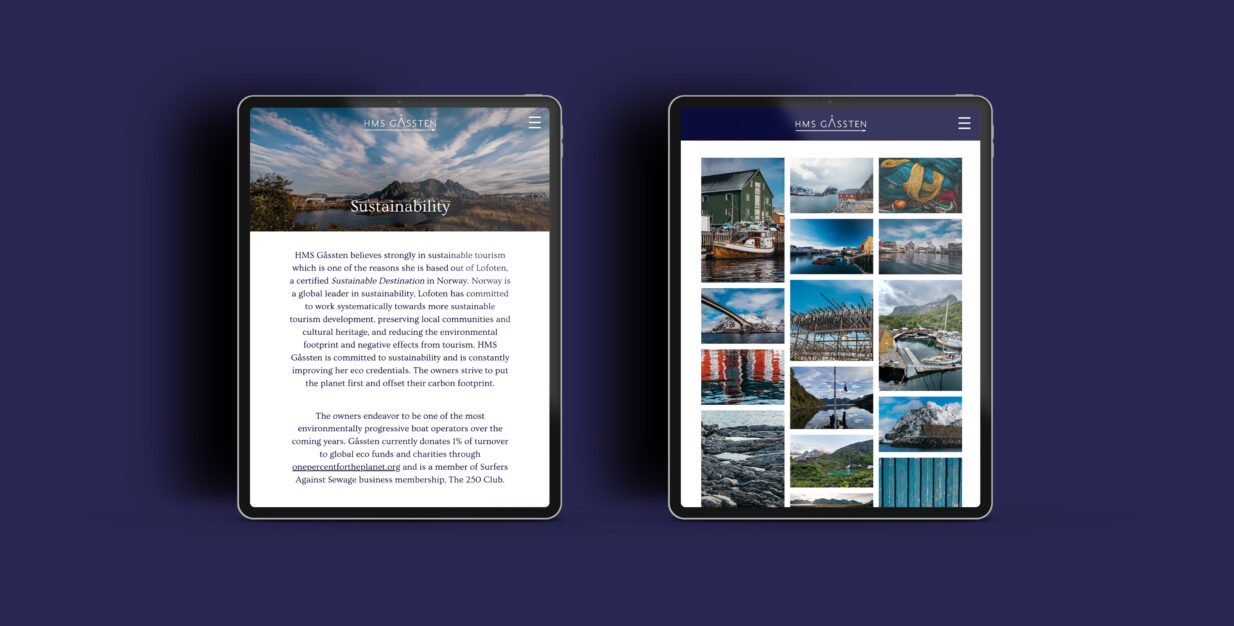
Scrolling through the many beautiful images across this website (captured by the fantastic Simon Biffen), you can quickly gather an understanding for how important the visual aesthetic of this project was. To highlight the image-led design, small details such as our hover effects and gentle overlays on the various galleries were a key part of this build. The HMS Gåssten logo sits harmoniously at the top of the website, with many elements of design echoing the clean and contemporary feel.
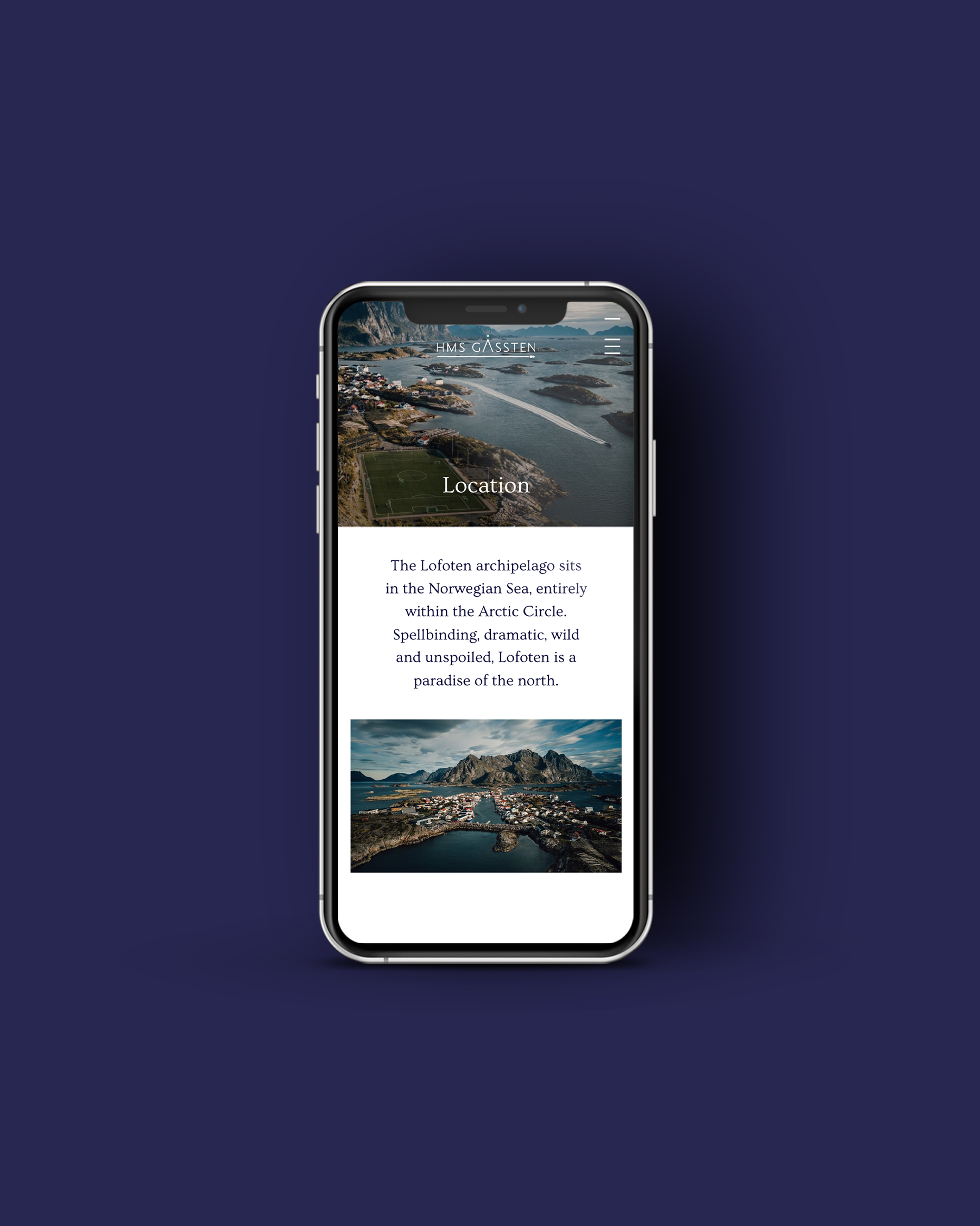
Considered typography
It was crucial that the modern, minimalist and classical look was consistent across the branding and site, so we selected Ovo for our headings, a serif typeface with old style characters, and partnered it with Jost for a clean and sleek sans-serif body font.
We wanted to create a site to match the excitement on board HMS Gåssten, fairly ambitious considering its life in the arctic circle and enigmatic history. Visit hmsgassten.com to experience the site for yourself.