

Rata Veterinary Surgery first began to recognise the need for a visiting veterinary service over a decade ago. At the time, not all owners were able to travel to distant referral practices for treatment and this new concept quickly took off.
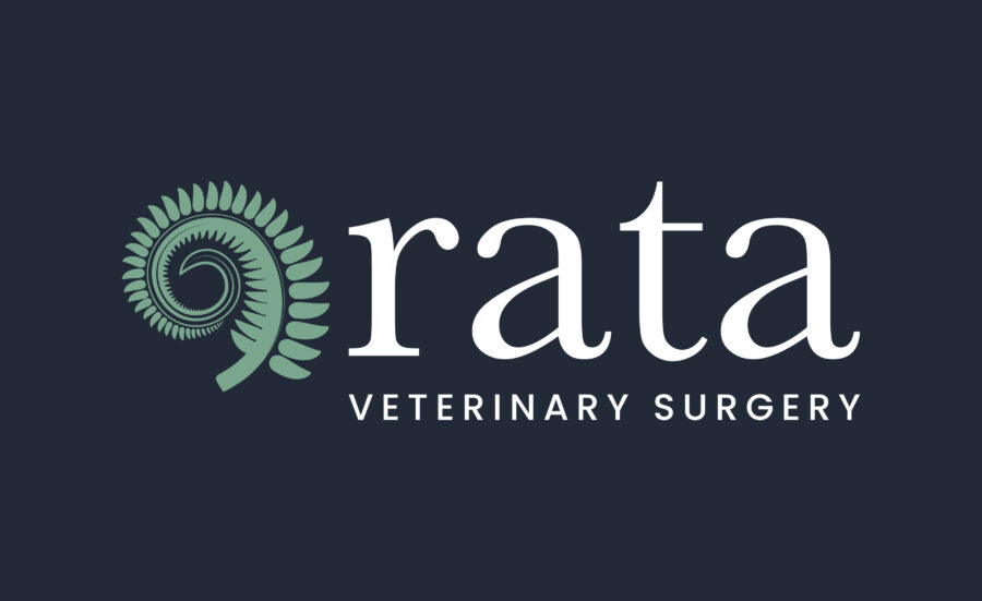
Re-designing Rata’s logo meant visually balancing their traditional and professional services with their forward thinking and contemporary ethos.
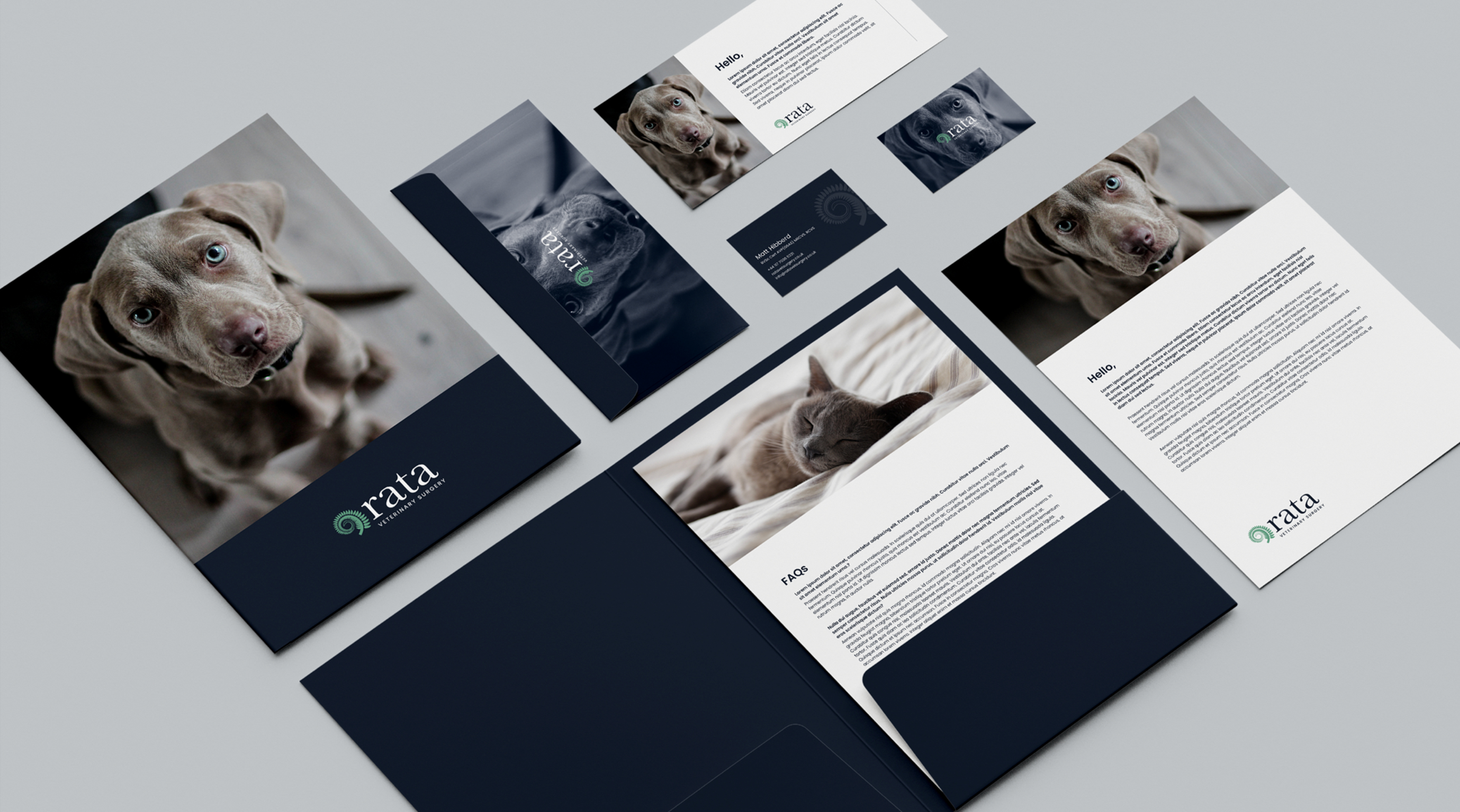
Three key logo design decisions to help tell Rata’s story:
- The two carefully selected typefaces of Baskerville and Poppins were chosen to deliver a traditional brand image with a modern feel. Using Baskerville in lower case does seem to achieve something modern and traditional at the same time; Poppins reinforces the modern edge as a clean, bold and legible strap-line.
- The striking colour palette has three core colours: dark blue, fern/clay green and pure white. This palette emanates the strength and depth of the company, but maintains the minimalist versatility that the logo required. We considered each colour based on their wider meanings – the colour green for growth and connection to nature, dark blue for formality and professionalism, combined with white for a clinical image.
- Finally, the unfurling fern – an iconic symbol of new life, also linking back to Rata’s roots.
The use of a fern illustration was important to Rata for a couple of reasons. With their origins in New Zealand, the logo continued to draw inspiration from Māori art, which often uses the circular fern as a symbol of new life and regrowth.
The circular shape and inward coil, which can symbolise perpetual movement in Māori art, also mimics the unit of compact bone called an osteon.
Check out their new look, along with the fresh new website we’ve also had the pleasure of making.