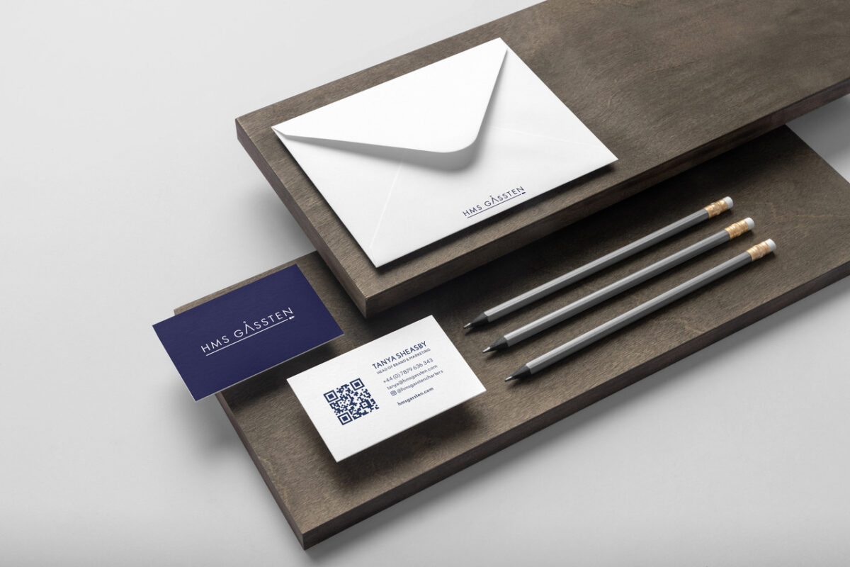
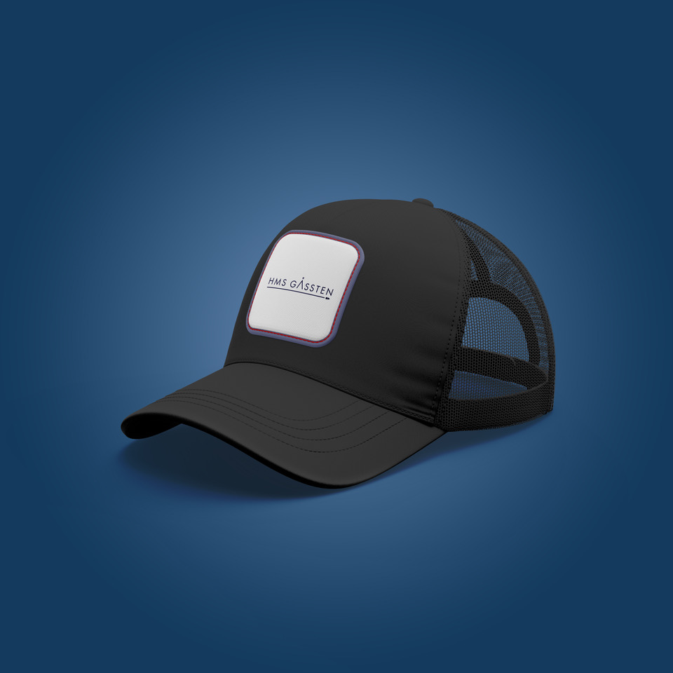
The mission for this logo design was to encapsulate a rich history, to evoke the feeling of decadence and class, as well as to represent the business’s hugely contemporary and ethical values. The HMS Gåssten began life in 1973 as one of the last wooden-hulled warships, but went on to be a key part of many different adventures. Nowadays, her journeys involve taking passengers through the Lofoten Archipelago to explore an array of activities within the Arctic Circle.
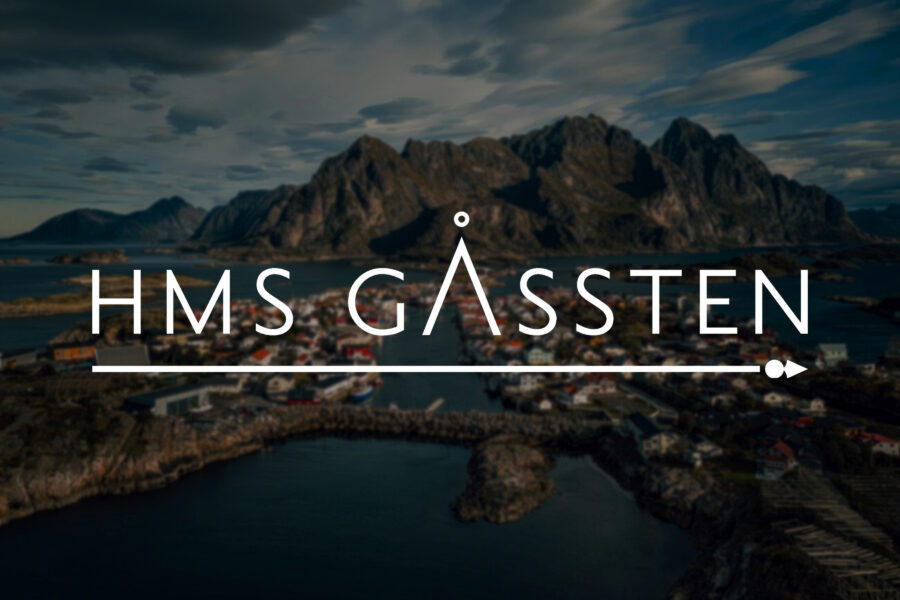
Taking a clean and minimalist approach, we selected Jost as our sans-serif font for the logo. This light, but effectively strong typeface feels powerfully elegant at the top-centre of every page and bears close resemblance to Futura – a true modern classic. Designing the page layouts around this beautiful branding was a wonderful task – find out more on this on the website case study.
We decided to embellish the A with a roundel above it to be interpreted by the user. Much like the mountains within the archipelago and rising above the fjords, the peak of the A towers over the other characters, with the shape representing the sun, the moon or maybe the northern star.
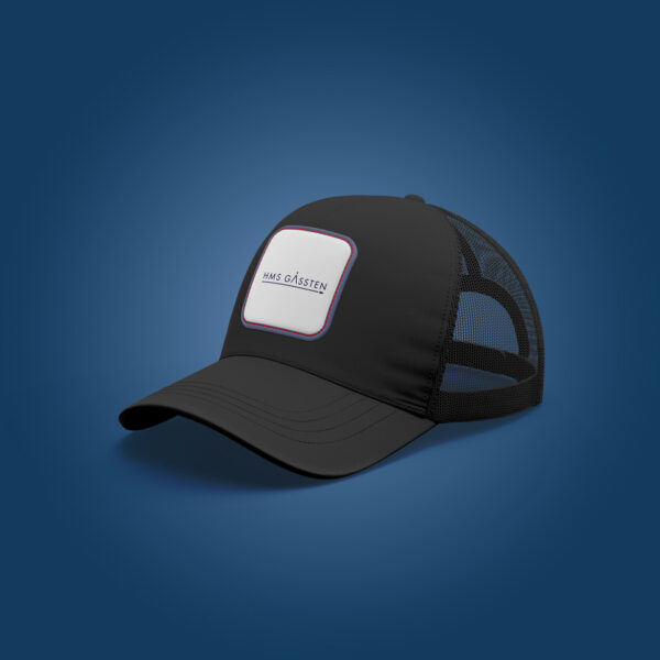
One of the prominent features of this logo design was the simple but characterful underline – which is also painted onto the hull of the vessel. This underline and arrowhead conveys direction and intention are aboard the HMS Gåssten.
As a member of Surfers Against Sewage’s ‘The 250 Club’ and 1% for the Planet, HMS Gåssten is a business committed to sustainability and supporting positive initiatives (much like ourselves). We created a fresh and modernly elegant logo for them to share alongside their good work – take a look for yourself.